Windows Explorer has been a weak-spot of both Windows Vista and Windows 7. Many users complained about it being inferior to the version used in Windows XP and a lot more frustrating to work with. Luckily, with Windows 8 things are improving a lot. After using Windows Explorer for a few days in Windows 8 Developer Preview, i can say that it rocks. It is a real pleasure to work with. Here’s twelve reasons why:
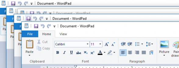
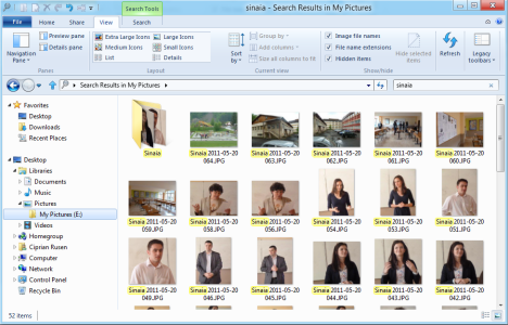
The first thing you notice about the Windows Explorer in Windows 8 is the ribbon. This interface concept was first introduced in Microsoft Office 2007 and has been improved with Microsoft Office 2010 and Windows 7 - where it was included in a few standard applications like WordPad and Paint.
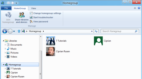
The ribbon in Windows Explorer is awesome for one simple reason: it is highly contextual. Depending on what you are doing, it will show only options relevant to your context. For example, if you click on Homegroup, you get buttons for sharing libraries and devices, changing your Homegroup settings, viewing the password of the Homegroup or starting the troubleshooter (in case you have issues with the Homegroup).

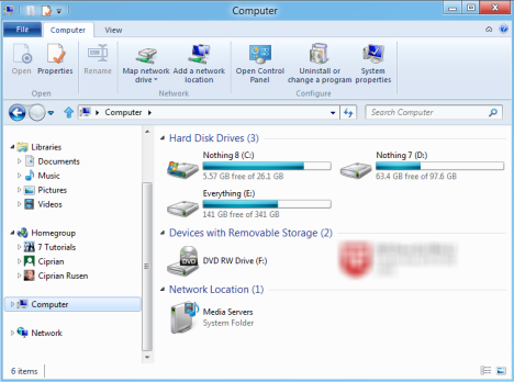
If you click on Computer, you get buttons for mapping network drives, opening the Control Panel or viewing your system’s properties.

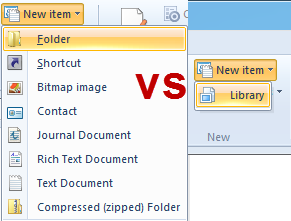
Another good example is the New item button which shows up while browsing your computer. If you are navigating a folder, you get options for creating folders, shortcuts or different types of files. When you are navigating the Libraries section, you get only the option of creating a new library.

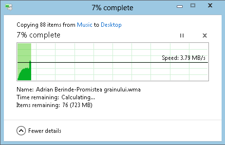
The way Windows Explorer manages file copy operations is simply awesome. You get a visual progress report about the transfer speed, you can pause, resume and close transfers with ease.

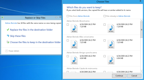
Also, managing conflicts with duplicate files is done in an awesome way: you can choose which files to keep in a granular and friendly manner and then continue with the copying.

Unlike previous versions of Windows, where people searched for better alternatives to managing file copying operations, in Windows 8 you no longer feel the need for such alternatives.
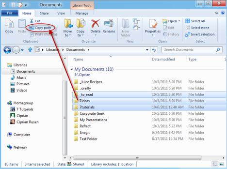
Geeks will love to hear about the Copy path button. Select any number of files and folders, click this button and the paths will be copied to the clipboard. You can paste the paths anywhere you need: from Notepad to a command line terminal.
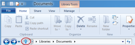
In Windows 7, lots of users complained about the lack of an Up button. Well... Windows 8 makes people happy and gives us back this button.
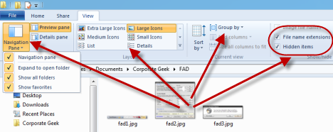
In Windows 7 and Windows Vista, many people had a hard time customizing how Windows Explorer shows the contents of files and folders. Windows 8 introduces the View tab in Windows Explorer, which gives quick access to all the important customization options: adding or removing panes, customizing the navigation pane, customizing the layout used for viewing files, grouping items and showing extensions or hidden files.
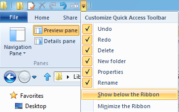
Another great feature is the Quick Access Toolbar. This is a small toolbar which includes shortcuts for common operations like: Undo, Redo, Delete, Rename, etc. It can be placed on top of the ribbon or below it and it can be customized to include buttons only for the operations you want.

Searching in Windows Explorer (and in Windows 8 in general) is very fast and returns better results when compared with previous versions of Windows. For example, running the search shown below in Windows 7, took much longer and it returned only the name of the folder relevant to the search term, but not the files which included the search term in their name.

In Windows 8 I got both the folder and the files plus, the speed was sensibly higher.
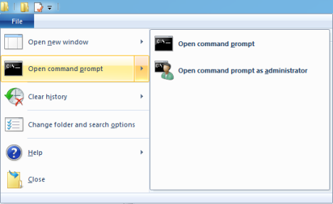
Another feature that will be loved by geeks, is the possibility to open the Command Prompt at your current location. Browser to the folder where you need to open the Command Prompt and click on "File -> Open command prompt".
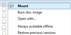
If you work with .iso images, you will be happy to know that Windows Explorer can mount them so that you can access their contents. You no longer need to install third party tools.
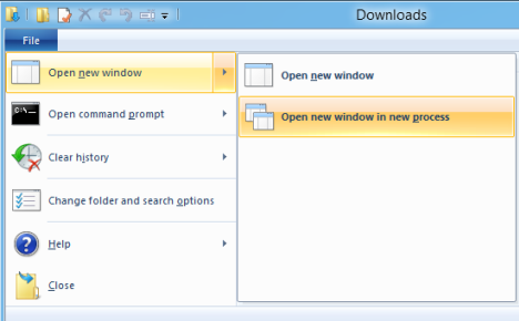
This feature is very useful to heavy users who work with multiple instances of Windows Explorer. You can make each instance run in a new process. If one of them crashes, it won’t crash the others. Therefore, the malfunctioning of a Windows Explorer instance won’t ruin the operations pending in other instances.
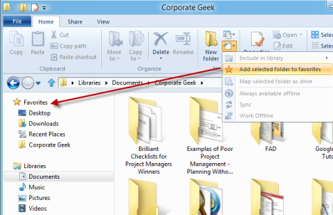
One great thing about the Favorites section in Windows Explorer is its presence in all dialogue windows about saving or opening files and folders. In Windows 7 and Windows Vista, you had to go through a bit of trouble to customize your favorite locations. In Windows 8, this is done via a button from the ribbon. You open the folder you want to add to your Favorites, click the button shown below and then "Add selected folder to favorites".
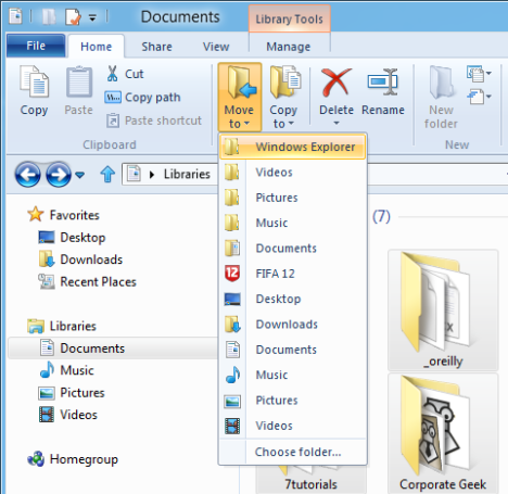
I saved one of the best features for last. In Windows 8, moving files and folders, or copying them to another location is much simpler. Select what you want to move or copy, press the appropriate button from the ribbon and select the new location. Much simpler and a lot more efficient, if you ask me.

I hope that I’ve made you curios enough to give it a try. Download the Developer Preview of Windows 8, install it and start using Windows Explorer. I’m pretty sure you’ll love what you see.
Windows 8 Analysis - Is the New Ribbon Interface More Efficient?
How to Make a Clean Installation of Windows 8
What is the SmartScreen Filter & How Does it Work?
Comments
I think you need to verify
I think you need to verify the title for reason 11 and 12, that are the same. I think the reason 12 it's about folders in general not favorite folders.
Good review anyway and indeed a lot of improvments to Explorer, but for geeks I think that Total Commander, especially TC Ultima Prima is the best. I don't understand why even at this stage they don't implement dual view pane of the folders, like in TC.
Actually, there are 12
Actually, there are 12 reasons. I simply forgot to update reason 12's title. Thanks for highlighting my mistake and thanks for the feedback.
Agree, a dual view would be great to have.
I agree on the dual pane
I agree on the dual pane comment. I would love to be able to hit F3 as I do in Linux and get the two panes.
But it looks like someone
But it looks like someone threw up all over the interface.
I agree, besides that:
1. Contextual Ribbon, takes too much space, silly icons and layout is way off.
2. Yay an awesome graph for copying files, I wish it would just speed the damn thing up
3. Copy Path button - takes too much space, rarely needed, the path copying is best using the old "path" listing (C:\files\etc)
4. Removing the button earlier was a huge mistake
5. Customizing the view is annoying with over 9000 options that 1% of users will use.
6. Search in Windows 7 really sucks, probably will still suck in Windows 8 because Microsoft doesn't know how to build a usable search function
7. Waste of space for that command prompt button, if you really need to get to that path you already have a CMD window open
8. Third Party mounting software will still be a lot better
9. Why can't Explorer do this automatically?
10. I think users rarely put more than 10 folders into favourites, this makes the "Add selected folders" waste of UI space.
11. Move to a list of common folders, why can't I just drag into my favourites then or other places in the left pane? waste of space again.
Regarding your point about
Regarding your point about search in Windows. In Windows 8 it is really fast and useful. It doesn't compare with anything I've seen so far, done by Microsoft.
And I am not saying for the sake of marketing Windows 8. I was really impressed with the speed and accuracy of search results.
If I create a file in said
(FYI, this is long, and rant like in nature, but every bit the truth, and apologies it is slightly peppered with the odd curse here or there)
.
If I create a file in said location, and then one minute later do a search for that file ... will search find it within the first 10 seconds?
.
Its a fallacy I find all to often, that the search only starts with the index, *NEVER* looks in the folder first for file names, and so I'm sitting there waiting for it to "index" or to find things that are RIGHT F**KING THERE on my screen in front of me..
.
Additionally when **I** am searching for files.. they aren't usually text, or picture, or various office documents, they are DLL files, they are EXE's, they are files that normally aren't in "libraries" because I'm looking for some file that shows up as running in my Task Manager etc...
.
I'm so sick of microsoft and their bs ... and ribbon bars? the "contextual" crap? I'm in my pictures folder ... and I've grabbed or CTRL+C'd a bunch of photos I want to place.. and there's no "New Folder" button .. WHY? because contextually some ass hat at microsoft thought "why would anyone want to create a new folder inside their pictures folder"
.
and why should I have to add it to some special user bar, only to have it duplicate based on the supposed type of folder I'm in?
.
And where's the option to set the view on ALL FOLDERS REGARDLESS OF THE F**KING CONTENT MS THINKS IS IN THEM?
.
Ie.. what if I want every folder, regardless of what and or where, to be viewed in Details mode ... I don't like my pictures being re-shown as thumbnials.. why? because of the THE TIME it takes EVERY TIME I go into a folder with pictures in it.. "oh that's only the first time cause then it builds a db of thumbnails" etc.. BULL .. WHY BOTHER EVEN THE FIRST Time if you don't want thumbails? and why then do I have to find EVERY type of "folder type" that microsoft thinks should exist..
.
Some of us want to be dumbed down by our OS experience, some of us want to see a default level of detail all the time ... at least the "last view" for some folders still works, but not if Microsoft had their way.. they've already thought they new more than me, knew more than everyone when they selected (and still do the f**king morons) when they "Hide Known File Extensions" ... the "Melissa" virus should have been enough to put that default selection out to pasture but obviously someone in microsoft is particularly hard headed about not doing inherently bad things.
.
Yeah.. I'm not a fan of microsoft and Windows 8 is doing nothing more than convincing me microsoft is beyond hope. You touchy feely mac-it-up people have ruined what the computer should be, and now its dumbed down for people who are 80 years old and never touched a computer in their lives.. as if that really exists any more... since kids today are weaned on QWERTY and suckled with GUI.
.
oh and PS. Command Prompt here.. really? something that's been available as a tweak since windows 98 and *that* is something that makes your list? How about, that should or could have been there from XP forward when it was realized by microsoft that people actually liked having that ability and would go out of their way to DOWNLOAD an additional add-on to make it available to them. (microsoft is retarded and getting worse every day)
.
And that doesn't even begin to touch on the stupidity of microsoft when they disabled Windows Mail with ACL foolishness.
.
I use XP Pro primarily. It works, its not riddled with gui add ons and microsofts' own access changes that since windows 95 (hell some things since windows 3.1) have always been engrained upon us ... right click here, and it gets you "that" option ... and that same foolishness that introduced Start -> search/type for program .... I'm only waiting for the moment crackers abuse the hell out of it, to get links into the menus that cause their programs to run when a user thinks they've selected "notepad" or some other common element to run..
.
as a user, I wouldn't be so pissed off at Microsoft, if they didn't make it so much easier for hackers/crackers to do more with the PC than what was presented to the average user. That microsoft hides things, makes it available for crackers to create folders named LPT or COM1 and then not have the ability by the user to simply "delete" or "del" if in a command prompt, it calls to question what they were thinking?
.
The change *now* from "Documents and Settings" to "Users" what sense was that? Sure "Users" makes sense but why now? why not back in NT and Windows 2000? Or in XP? And why now "My Documents" is "Documents" when every program in the world was redesigned to look for "My Documents" because of microsoft's changes back then... and which leads now to these "mount points" that can't be user clicked upon if we're not hiding them, because we don't have access to a mount point that is supposed to work for OUR OWN stuff??
.
really did microsoft just leave a monkey in a room with a dart board and let the throw of the dart make the choices? What's going to happen in the future when microsoft again thinks they've gotten it wrong.. another redesign that further changes all previously known keyboard shortcuts and right click menus?
.
One last dig at the 12 great things.. Copy To and Copy Path? really? so if you have the folder in front of you, its soooo much harder to just click *one time* in the Address bar, and then copy the path from there? Oh that's right, your dealing with Libraries, rather than *YOU THE USER* treating your "Documents" like a filing cabinet .. oh.. they never told you about that.. that keeping things in order will help you find sh*t later on... I guess you never had a mother or father that never told you to clean your room ... so that you could find stuff.. etc..
.
/rant its simple, microsoft is broken, these little "happy happy" things you folks come up with are the wrong ways to approach microsoft "oh they're giving us" ... what they should have done long ago, and they are further making it complicated to customize to *your* needs, or to allow *YOUR CHOICE* of interface .. etc.. Microsoft you'll take it like we give it to you.. today.
Reason 1: The Contextual
I have Windows 8 downloaded,
I have Windows 8 downloaded, but not yet installed on anything. The more I learn about it, the less enthusiastic I become about it. I loathe the very idea of the screen robbing ribbon. When I install a new installation of Windows 7, the first this I do is disable Libraries, then Favorites, then Homegroup. The ribbon in Office 2007 and 2010 makes Zoho the much preferred word processor on my desk. I know which applications and folders and files are my "favorites" I don't need an additional folder taking up precious vertical screen space to duplicate these items. I don't need libraries, because I can open them from their actual location much easier than to open them from some remote location that "forgets" things. I have NEVER gotten homegroups to work on my network for some unknown reason, but I have no difficulties whatsoever with "the old way", so Homegroups has no need to be. By the way - If the Ribbon were replaced with intuitive drop down menus, the guick access toolbar, which is a necessity with the non-intuitive click, click, click, click ribbon, would also be totally unnecessary.
It does appear that Windows 8 is just another step in the downward spiral that Windows OSs have been in since Windows 2000.
I just may never install Windows 8.
Who was the 'genius' at
Who was the 'genius' at Microsoft that got away with the Up button in the first place?
I would like to answer to
I would like to answer to those who said that:
- the ribbon is too big/occupies too much space - the ribbon can be minimized with a double click on the row where you see the titles of its sections. If you do this, you are actually left with much more space than in previous versions of Windows. You will have the Quick Access Toolbar where you can add small buttons for your most common actions and a row with the titles of the ribbon sections, which can be brought back only if needed.
- too much bloat for file management operations - the screenshot I posted was for a "full details" window. If you press "Fewer details" (which is actually the default view), you get a smaller window and the useful pause/resume, close operation buttons.
What I find funny are some of the complaints people make about features which in the past where available only through registry hacks (copy path, opening the command prompt at the current folder, etc). Apparently, having them available now by default, without any registry hacks is not useful anymore. I guess many still have the habit of complaining and bashing Microsoft, even when they show that they started to listen to feedback.
Personally, I love the ribbon from the days when it was introduced in Microsoft Office. I love to see it in Windows 8. It helps me be more productive and I don't see it occupying that much space. Nowadays big monitors with big resolutions are so common, that you have enough space to view everything.
Also, I love to see Microsoft improving. Even if some might not like certain things about it, you cannot say this new version is not an improvement. Yes, it still needs other improvements (like a dual pane view) but it is an improvement in the right direction.
And can you state, with a
And can you state, with a straight face, that the ribbon is as intuitive as the old drop down menu system and can you truthfully state that 3 to 5 mouse clicks are not required to perform the same operations that were possible with 1 to 3 mouse clicks in Office versions prior to Office 2007?
It is true that the ribbon can be minimized such that it only consumes 1 1/2 to 2 inches of vertical desktop space while you have it expanded searching for some hidden function, but you are adding yet another mouse click to perform that desired function. It is just SO counterproductive to introduce a product or a feature that consumes considerable vertical desktop space at a time when monitor manufacturers are phasing out monitors with reasonable vertical to horizontal ratio and replacing them with 16-9 panoramic movie aspect ratios. I don't watch panoramic movies on my computer - but that is another topic.
DOWN WITH THE RIBBON!
I have not made measurements
Actually - that would be one awesome study to make: compare 50 most commonly used functions in Microsoft Word 2003 vs Microsoft Word 2010 and see how many clicks you need on average to access them. If we find the time, we should make such a comparison.
Personally, I think it is both a matter of perception and habit. I did not like too much the old interface paradigms. I find the ribbon refreshing and easier to work with. For some tasks I'm sure it will take me longer with the ribbon, while for others less. The idea is - I perceive it to be a better interface, more open, more friendly and most times it makes me feel more productive.
The idea with the study sounds more worthy of following up, the more I think about it.
I cannot put my finger on the
I cannot put my finger on the URL at the moment (perhaps some reader will offer the URL), but Microsoft published an Excel Worksheet when Office 2007 was in its infancy. The worksheet basically showed the necessary path (mouse clicks or similar user input) to arrive at a certain function in Office 2007 compared with the path to the same function in Office 2003 and prior. This worksheet quite vividly demonstrates the additional user input required with the Ribbon. I submit that if a person feels more productive with the ribbon, they have not done an objective time-and-motion study with equal expertise in both formats and only feel more productive because they are "busier" working with the ribbon.
Ciprian: - the ribbon is too
Ciprian: - the ribbon is too big/occupies too much space -
Sailfish: I can rationalize the ribbon in Office since they added a lot of bloat (e.g., themes, &c) that required much more toolbar space. The fact is, most of the functionality I ever need in Office apps are contained in the primary ribbon Home tab. Windows Explorer is a different animal all together. I suspect that if they ever decide to publish usage stats they'll see that 99% of the operations are performed in the Home tab. I'm sorry, this is a classic example of bloat progression, i.e., adding cycle-wasting and memory-wasting code that only a very few will ever exercise.
Ciprian: - too much bloat for file management operations -
What I find funny are some of the complaints people make about features which in the past where available only through registry hacks (copy path, opening the command prompt at the current folder, etc). Apparently, having them available now by default, without any registry hacks is not useful anymore.
Sailfish: The point wasn't to belittle the new features (after all, my very point indicated that I use it via hacks) but to suggest that the better way to implement them would be via right-click context menus rather than adding them to a toolbar. btw, another hack I've added to my context-menu is to put a folder's filelist on the clipboard. It's not something I use a lot but, when it's needed, it's invaluable.
Ciprian: Also, I love to see Microsoft improving. Even if some might not like certain things about it, you cannot say this new version is not an improvement. Yes, it still needs other improvements (like a dual pane view) but it is an improvement in the right direction.
Sailfish: It's only an improvement if it increases one's productivity; otherwise, it's the opposite. Regarding the Windows Explorer ribbon, I guess we'll just have to agree to disagree on this.
@john3347 & @Sailfish - When
@john3347 & @Sailfish - When I find some time, I will do my best to document myself and make some benchmarks on the productivity of the ribbon. Then I will publish the results and I think we can resume the conversation then, when we have more facts. :D
@john3347 - if you ever find that link, please share it with me. It would be a very useful read. :D
http://office.microsoft.com
http://office.microsoft.com/en-us/templates/CT010213032.aspx?tl=2&AxInst...|
This is the URL for the Word 2003/Word 2007 comparison guide. This does not go directly to the spreadsheet, it is actually only a link to the download. You have to allow some permissions along the way to open the actual list. There are comparable lists available for other Office 2007 (and 2010) products. There is also an interactive guide available that lets you select from a sample Office 2003 (whichever Office product you are dealing with) home page and it will show you the (winding) path to the same function in Office 2007. There is also a comparable interactive guide for Office 2010 available which I have not dealt with.
Thanks John.
Thanks John.
I actually went ahead and made that study I talked about. You can read all the results here: http://www.7tutorials.com/windows-8-analysis-new-ribbon-interface-more-e...
This all should have been
This all should have been done long time ago after XP.
All of this is not interesting at ALL!
sorry but I only find 2, 7, 9
sorry but I only find 2, 7, 9 and 10 as useful..
pretty much everything else is pointless since you can already do through context menu (right-click).
Perhaps in the interest of
Perhaps in the interest of productivity, functionality and asthetics, the best way forward might not necessarily be in the effort of honing UI behavior striving for balance in a tug-of-war between form and function amidst the clamor and chaos of clashing user opinion. Perhaps its time for keyboards to undergo a little selective breeding to help maintain the ecosystem before our operating systems evolve an over-compensating complexity. Could basic OS functions be driven by an additional set of standardized keyboard keys thus reducing the need for ribbons and extra tool bars or is the idea intrinsically the same thing, solving nothing in the long run?.. I dunno but I love the extra definable macro keys on my gaming keyboard which allow for some real slick OS navigation..
I liked Windows Explorer a
I liked Windows Explorer a lot, but some of the features explained here, like opening WE in a new process, were already present in Windows 7. The only thing is that the feature in W7 was less obvious, and required a registry modification to show up in a context menu. It's there, though.
Add new comment